Chiba University
ITOYA
Jan - Feb 2017
Graphic Design
Logo Design
Branding
This is a collaboration project with ITOYA during the exchange semester at the Chiba University of Japan. ITOYA is a leading stationery company in Japan and it wished to create a new sub-brand. The design brief of this project is to develop a new series of stationery for the existing audience of ITOYA. My group decided to look into the concept of “ha-ji-me-ma-shi-te” stationery, which means “nice to meet you” in Japanese.
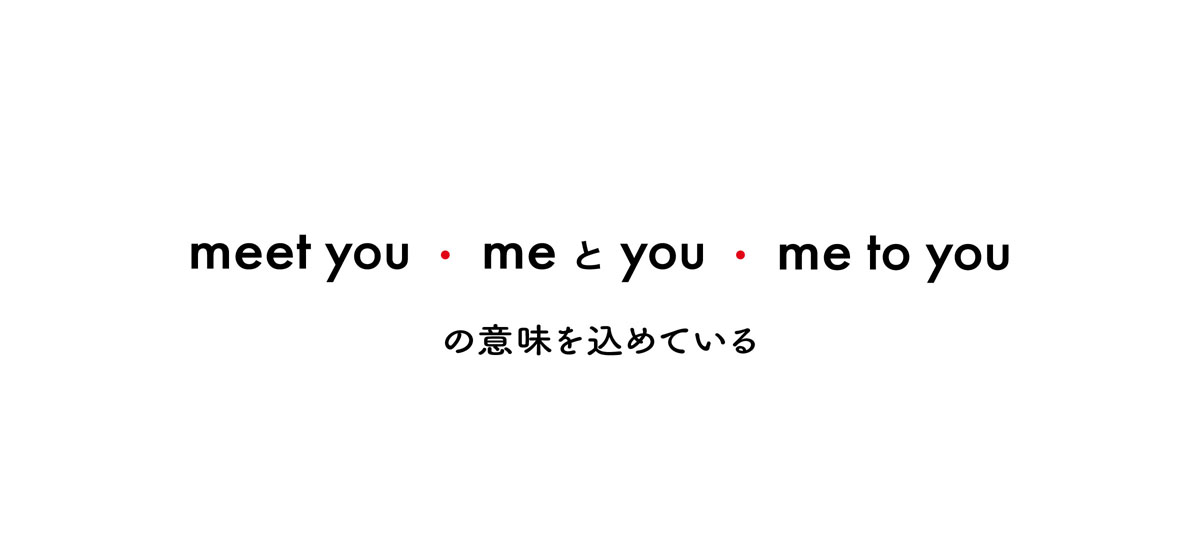
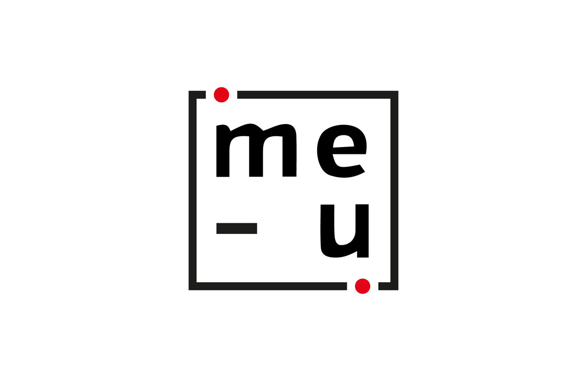
Japanese people have a culture of exchanging gifts to express their gratitude and their wish to continue with a good relationship. This logo derives from the meaning of “nice to (meet you)”, which in Japanese pronunciation would sound like “me-to-you”. This logo carries the meanings of “meeting you” (the symbol of greeting), “me & you” (the relationship) and “me to you” (the act of giving). The colour scheme, shape and font style are chosen to match with ITOYA’s brand identity.